
More than A YEAR ago, I posted that we had just decided on the final colors for our bedroom redesign. Well, Young House Love we are not, because it was just a few weeks ago that we hung the last of the pictures in our room, finally completing our year-in-the-making bedroom redesign.

Oscar the cat welcomes you to our new bedroom.
The bulk of the work got done last fall, when we painted the walls and the ceiling, spray-painted the radiator, and bought and assembled the furniture. But then it took several months to paint the closets, buy the ceiling fan and bedside lamps, and buy and frame the art. The devil's in the details, I guess.
But now! It's all done! And I'm SO excited to share it with you!!
First: our inspiration.

A dear family friend made us this quilt for us as a wedding gift, using our wedding colors and including, completely coincidentally, a verse that our officiant used during our ceremony (which was unplanned by me). We love this quilt and what it symbolizes, so we wanted to incorporate it into our bedroom decor. All of our colors were pulled from it, including the wall color, curtains, and artwork.
Here are our paint colors (all Behr paint from Home Depot)

I knew I wanted a bright green for at least one of the walls. But I had a very specific idea of what I wanted that green to be: not neon but still bright, a little olive-y but not TOO olive-y, etc. And after testing a bunch of different colors, we settled on Scotland Isle. It's perfect.
The tan color was an easier decision. We saw Brown Teepee and loved it immediately. We still love it so much that we'll probably use it in many other rooms in our house.
And our trim is Polar Bear in an eggshell finish, which we used for the closet doors as well.
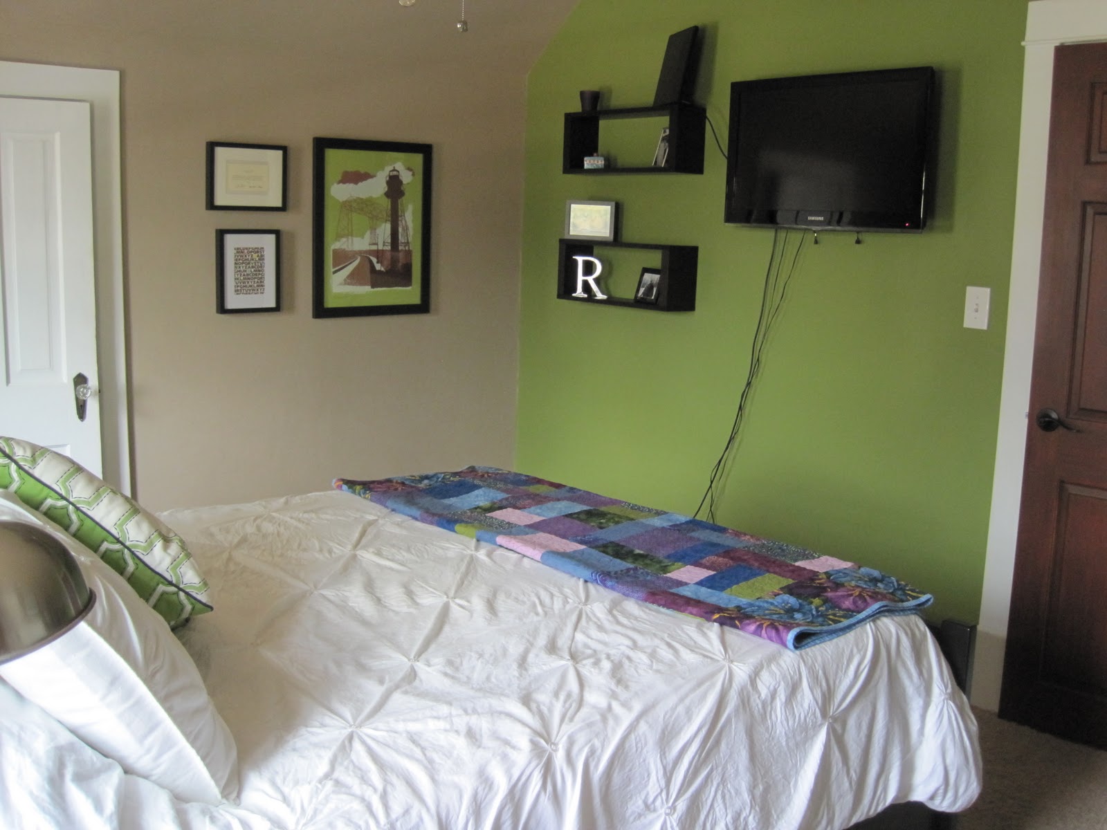
the paint colors in action, along with our Crate and Barrel wall boxes and new flat-screen TV (thanks, in-laws!)
Because our house is more than 100 years old, there are some cool old quirks that we used to our advantage when painting and setting up our room. For example, the sloped ceiling allowed us to paint a continuous line with the tan from floor to ceiling to opposite floor.
What isn't so great about an old house, however, is the tiny-ness of the room. With the door into the room on one wall, the windows and a giant radiator on the opposite wall, and closets on both side walls, it was difficult to find a place for our bed. Previously, we shoved the bed into a corner and called it good. But now, since we were buying grown-up Ikea furniture, we wanted to make our bed more of a focus. So we said sorry to the radiator we had just painstakingly painted and put the bed right in front of it (several inches out so as to avoid a massive fire).

The shiny new spray-painted radiator, which we had to paint in the room because it weighed approximately eleventy-billion pounds and we couldn't move it. Spray-paint fumes, hooray!
As previously mentioned, we got our furniture from Ikea. This wasn't exactly planned - we loved the Hemnes collection from day one, but looked around for several months to see if there was something better out there. There wasn't. Who knew it was so hard to find non-ugly, non-overpriced bedroom furniture?

Hemnes dresser next to our built-in drawers and the shoe closet. In the frame is the 2010 St. Paul Bike Classic poster, which was done by Adam Turman.
The story of our curtains is largely the same. We wanted something simple and relatively inexpensive, and after searching around for some time, we found curtains at Target - the Eclipse Twine Thermaback curtains in Wine, to be exact. We liked the grommets and the heavy fabric, which blocks out the sun and cold weather and sometimes makes us accidentally sleep until noon on weekends.

The bedding and throw pillow were also Target purchases.
This admittedly bad photo of our curtains also gives the best look at our bedside lamps. Instead of traditional lamps, we decided to stick with a modern, clean look and chose two table lamps from Creative Lighting in St. Paul. We got super-bright CFL light bulbs and I swear you can see those things from space. Which is kind of good because they pick up the slack of our ceiling fan.

In the interest of eco-friendliness, we got an LCD ceiling fan from Home Depot. Upon getting it home and installed, we realized that LCD lights are not so great for lighting an entire room. We love the look of the fan (and it proved essential for sleeping in our non-air-conditioned house during this hot, hot summer) so we decided to leave it.
For our artwork, we found an Adam Turman print of the Duluth lift bridge at I Like You. Because that's where we honeymooned (and where we return every year to celebrate our anniversary), we had to have it. The fact that it was almost identical to our wall colors was just a bonus.

We hung the lift bridge print next to our wedding card from the Obamas and a greeting card from MadeByGirl.
We also decided to paint the inside of both of our bedroom closets.
Here is my half of the big closet looking out (with the florescent light on, which is why it looks so neon):

and with the light off, looking in.

and the shoe closet, which we painted tan:

And that's our new bedroom! We love it so much - it turned out modern and bright while still being comfortable and relaxing, which is exactly what I wanted. And it only took a year!

Oscar bids you farewell.
Thank you so much for reading through this long post! Let me know if you have any questions/comments/suggestions on how to hide the cords from our TV (please?)...


3 comments:
Hello Oscar. Your mom and dad have the best room.
Love your built-ins! The green on the walls is very pretty and soothing! Cute kitty!
Lindsey Turner
http://thriftandshout.blogspot.com
(If this comment posts 6,537 times I'm truly sorry....)
1. It's adorable! Colors are awesome and VERY you.
2. I totally gave you the R as a wedding gift :-)
3. I'm giggling at the thought of you getting into your closet for that "inside" pic.
4. LOVE Adam Thurman AND i like you!
Traycina
Post a Comment